Helping shy hearts find real connection. Designed to get people off their phones and into real life.
Project Type
UX Design
Case Study
App Design
Overview
Neareal was born from a simple question: why do we feel braver behind a screen than face-to-face? This project bridges the safety of technology with the spontaneity of real-life encounters, helping shy hearts build authentic connections in person.
My Role
I owned the project from start to finish, leading all aspects of design and research, including:
User research and synthesis
Competitive analysis
Ideation and concept development
Wireframing and prototyping
Usability testing and iteration
I worked across both UX strategy and UI design to ensure that Neareal not only reduced the anxiety of in-person interactions but also encouraged genuine, spontaneous connections, bridging the safety of technology with the excitement of meeting face-to-face.
Tools
Figma
FigJam
Illustrator
The Challenge
Despite a strong desire for meaningful in-person relationships, many young adults struggle to meet in real life.
1 in 3 young adults reports feeling socially anxious in everyday situations.
45% of Gen Z men (ages 18–25) have never approached someone in person for a date.
40% of Americans identify as shy.
Digital “swipe culture” dominates, but it often leads to burnout, shallow interactions, and missed opportunities for genuine connection.
Opportunity: Could we design a product that lowers the barriers to meeting in person and helps shy people feel more confident in everyday social settings?
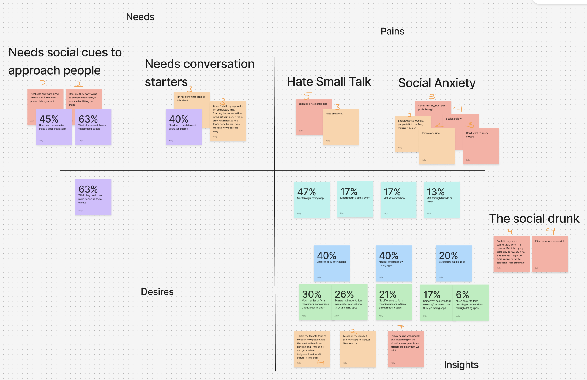
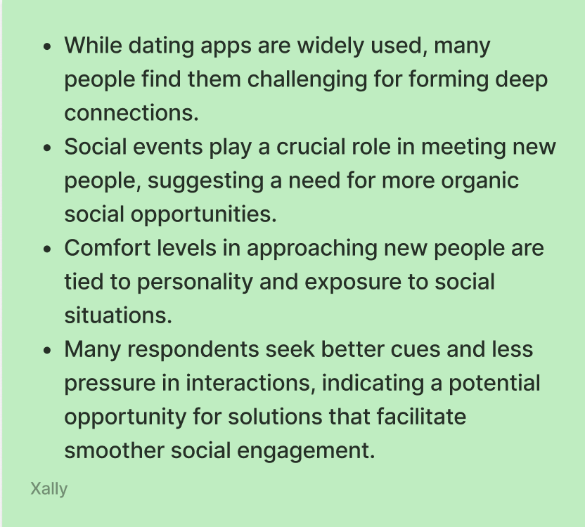
Research & Insights
I ran interviews and surveys to understand why people feel hesitant about approaching others in real life. Mapping the findings in FigJam helped me spot patterns in needs, pains, and desires, and guided me toward the core problem worth solving.
Key Takeaways
Market Trends
Loneliness and anxiety have been steadily rising since 2012, despite increased digital connectivity.
Emerging Insights
People want clearer cues to approach others in public places.
Swipe-based apps often feel transactional, not meaningful.
Tone and reassurance are as critical as usability in encouraging real-life action.
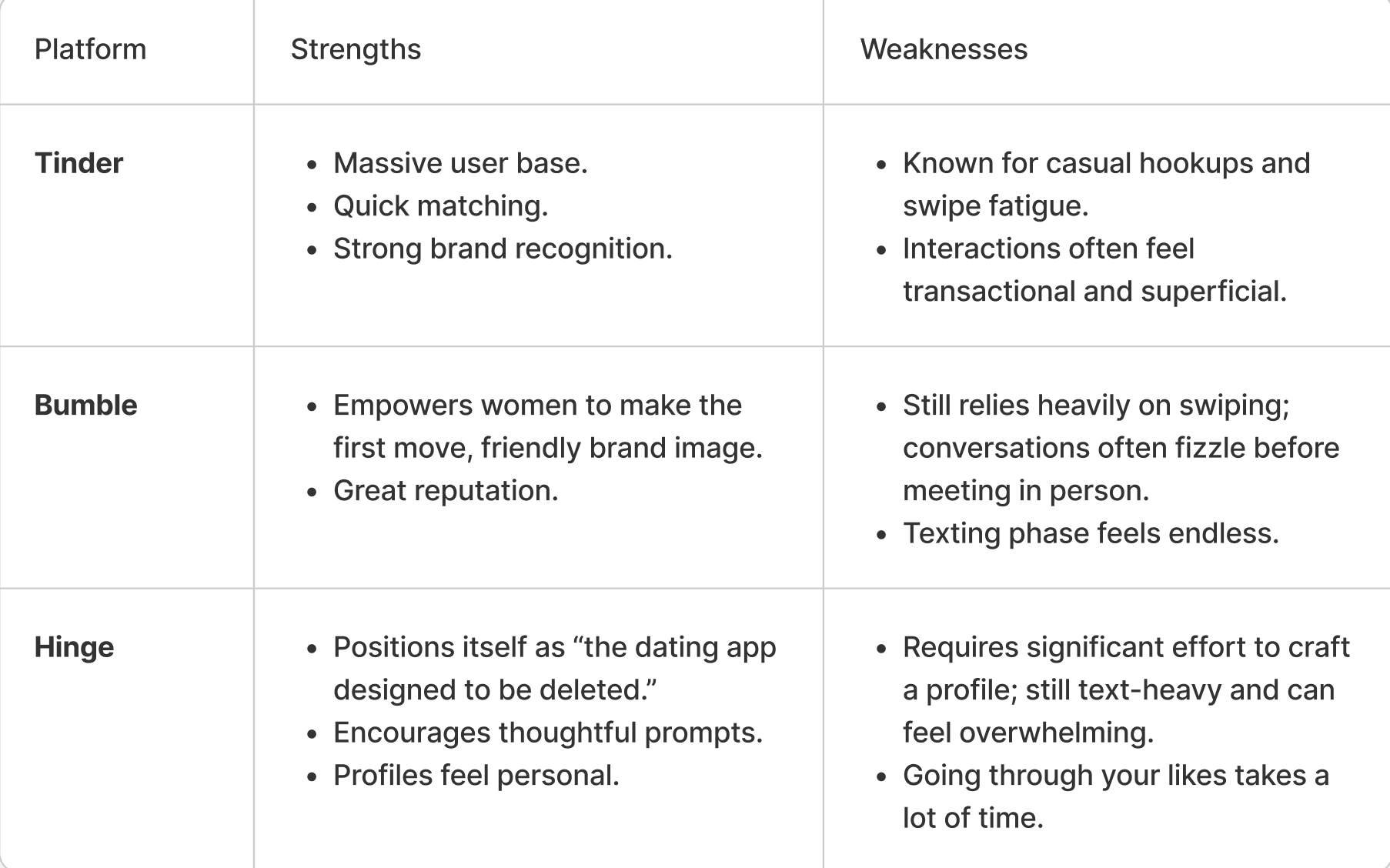
Competitive Analysis
To better understand the dating app landscape, I looked at three major players: Tinder, Bumble, and Hinge. Each offers unique strengths, but also leaves gaps that Neareal aims to fill.
While existing apps help people connect digitally, they often stop short of supporting real-world interaction. Neareal bridges that gap by lowering the barrier to in-person connection, helping shy users feel confident enough to move from screen to reality.
Competitors
Opportunity For Neareal
Finally get rid of the endless swipping and create a platform focused on depth and genuine face-to-face encounters.
Provide clearer in-person cues and reduce anxiety in taking the next step offline.
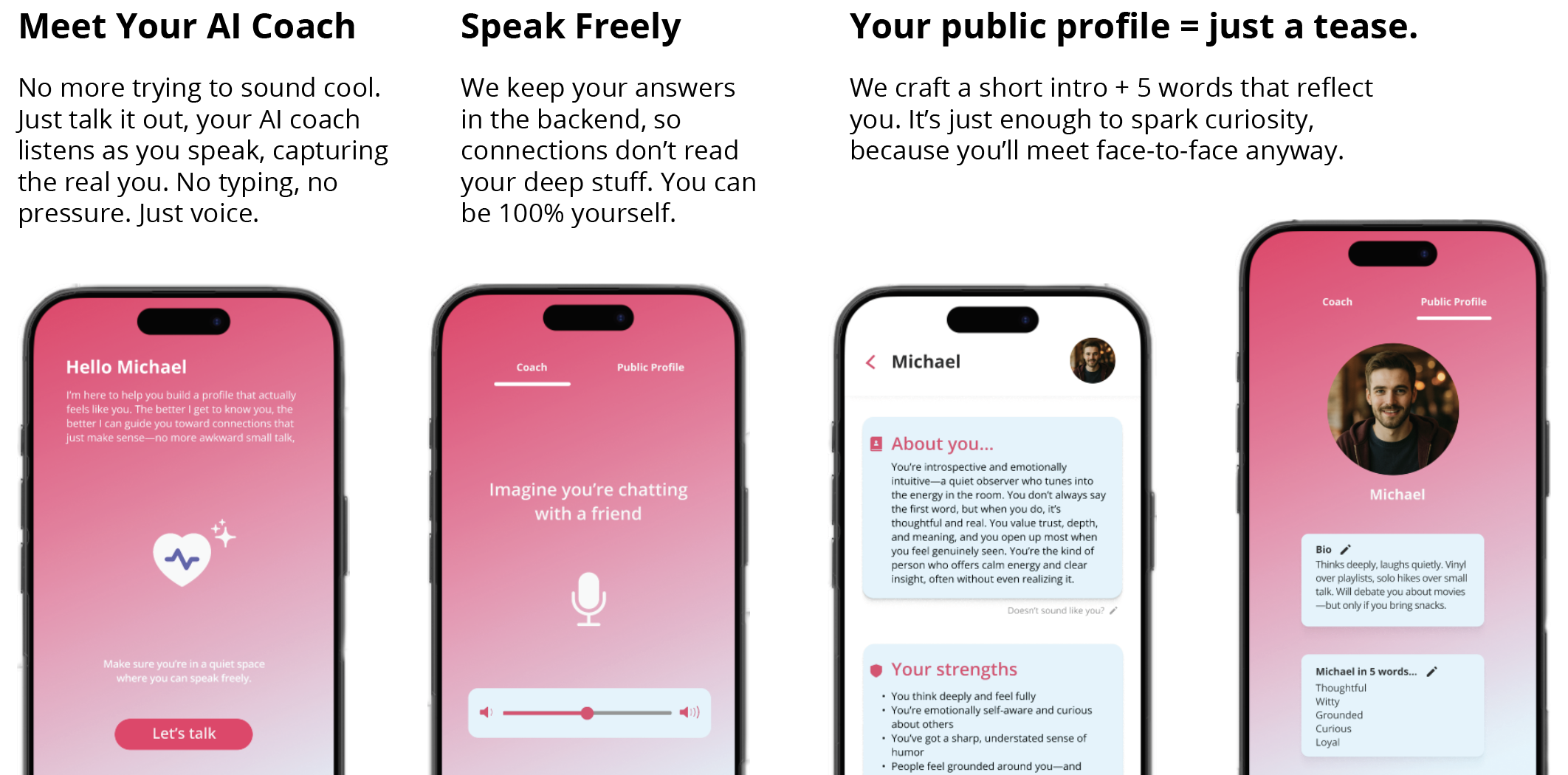
Simplify profile creation with voice-based AI coaching to highlight authenticity without added pressure.
Many young adults want to meet people in real life but feel too shy or uncertain to approach others. Current dating platforms over-index on digital swiping and don’t support genuine, face-to-face connections.
The Big Idea
If we’re already out living our lives, sitting in a café, browsing in a bookstore, or waiting at a bar, and our potential life partner is right across from us… why should we miss that chance?
That said, I'm ultimately hoping to:
Help people step away from their screens and rediscover the courage to connect in real life; to look up, notice the person sitting nearby, and take the chance to start a conversation.
I didn't stop there
Of course, this goal allowed me to think more. What if...
Neareal could bring back the confidence our parents and grandparents once had?
That confidence didn’t just spark romance, but also increased overall happiness?
People found the courage to take on other challenges in their lives?
My app would help build stronger, more meaningful relationships, not only with partners, but with friends and communities too?
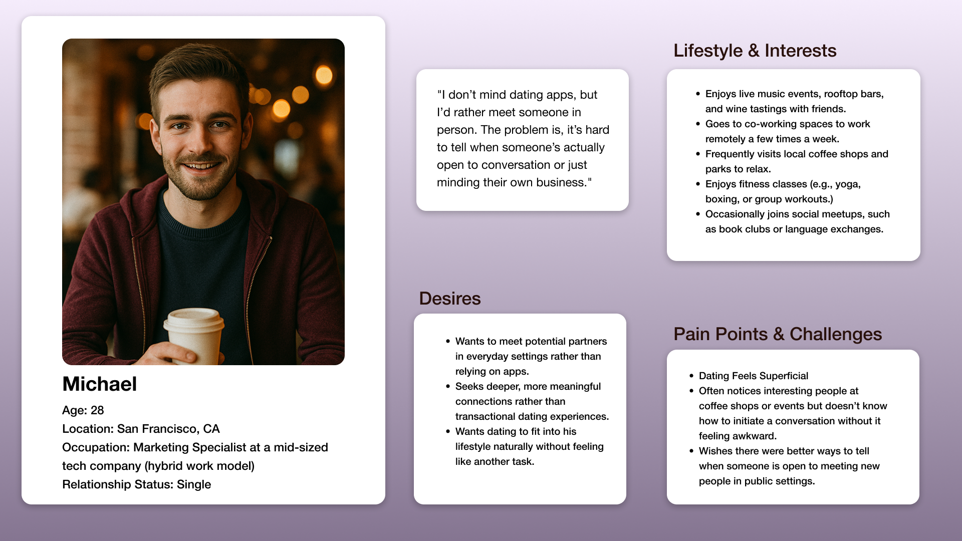
Who am I Designing For?
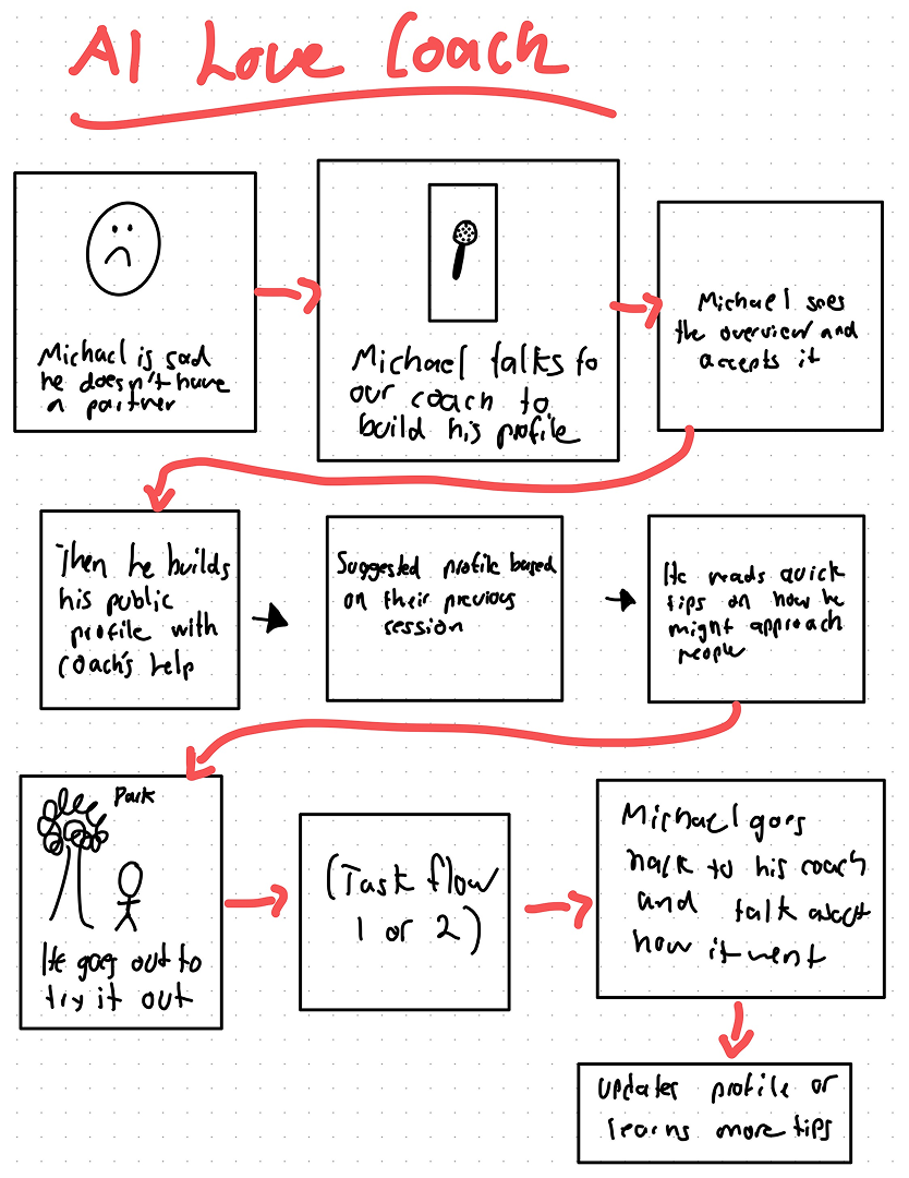
Meet Michael
Michael helped me to keep digging deeper and keep questioning myself. Some questions arose...
How might we help Michael form meaningful connections
How might we help shift the culture of modern dating toward deeper emotional connections in a way that is fun, modern, and effective?
How might we help Michael meet potential partners in person in a way that feels natural and stress-free?
How might we help Michael navigate public social spaces for dating in a way that reduces awkwardness and increases confidence?
Ideation & Design Process
I explored multiple concepts before arriving at the final direction.
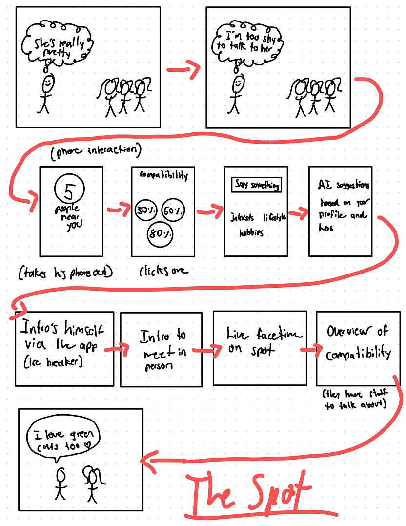
Early Wireframes and storyboards
Creating these storyboards helped me step into Michael’s shoes and imagine how he, and others like him, would ideally use Neareal. It gave me a first-hand sense of how the app could fit into their daily lives and how it could help them feel more confident.
Michael's firts thoughts when he's at the scene
Michael creating his profile and using our app
Task Flows
After revising the early storyboards and obtaining feedback. I moved on with creating three main task flows
1. Creating your profile
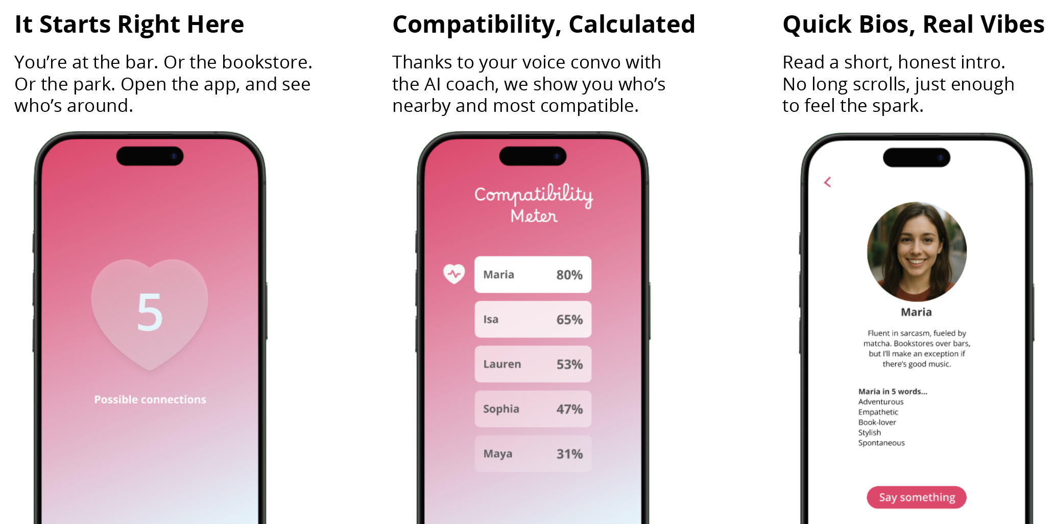
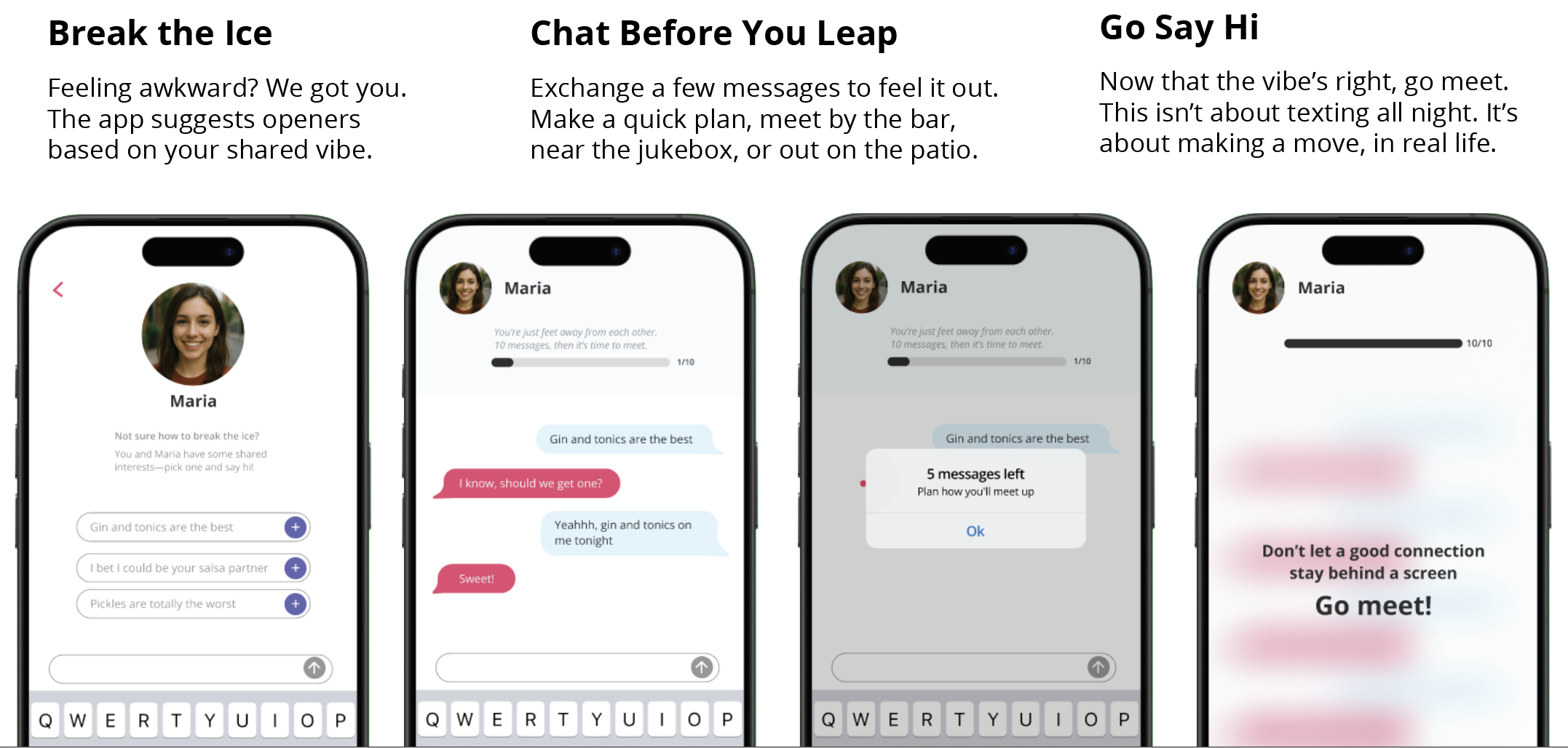
2. Finding connections
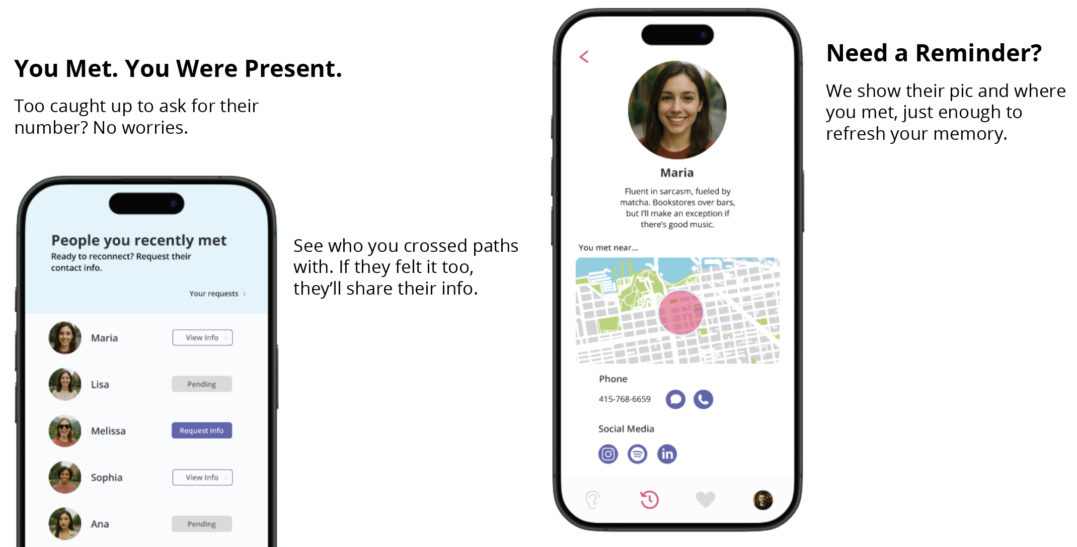
3. Reconnecting after meeting
After defining these three core task flows, I brought them to life through low-fidelity paper prototypes. I tested these with users to quickly spot friction points and gather first impressions.
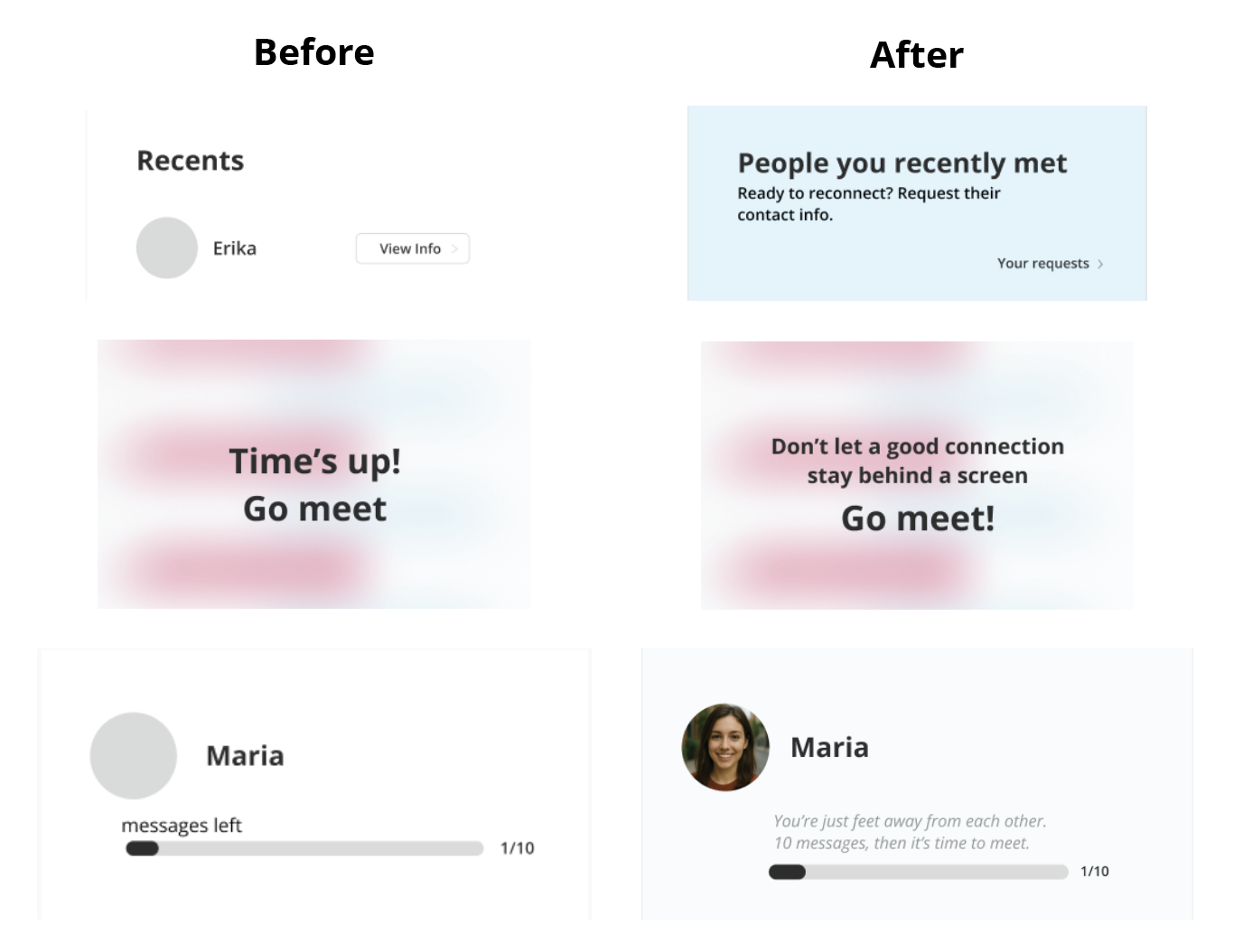
What Went Wrong
Users found the floating circles confusing. The layout felt chaotic, and the meaning behind the percentages wasn’t clear.
Even though it was a test, users hesitated when it was time to meet. They freaked out with the Go Meet alert; The overall tone of the app felt too neutral, missing the warmth and reassurance people needed to step out of their comfort zone.
How I Fixed It
I replaced the circles with a clean, organized list to create visual hierarchy.
I used color highlights and a small icon to spotlight the best match, making it instantly recognizable.
I reworked the voice of the entire app to feel like a supportive friend, casual, encouraging, and anxiety-free.
Result
A clearer, more intuitive interface that helped users instantly understand who to focus on.
A consistent, friendly tone across the app that made users feel more at ease, and more excited to connect in real life.
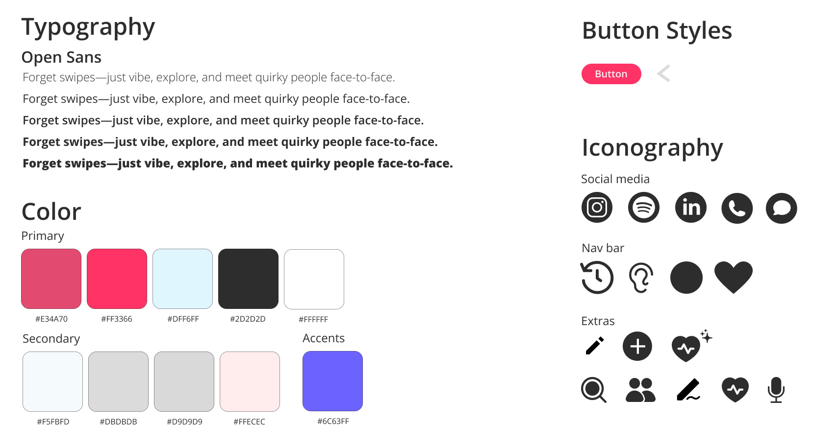
Styleguide
After testing and refining the low-fidelity prototypes, I was confident in the core flows. The next step was to establish a visual system that would guide the high-fidelity designs. I created a style guide to ensure Neareal felt consistent, approachable, and supportive across every screen.
Because the best relationships don't start with a swipe, they start with showing up.
Let’s Build Your Profile
Finding Connections
Reconnect
Try the prototype
Metrics & Impact
While not yet live, I defined success criteria for evaluating impact:
Adoption & Engagement
Profile completion rate: % of users who complete their profile with our AI coach.
Profile creation time: Avg. time from first open to profile ready.
Behavioral Metrics
Open rate at target locations: % of users who open the app while at social places (e.g., bar, bookstore, park).
Initiated in-person meetups: % of users who clicked “go meet” or used suggested openers.
Repeat usage: How many users returned to the app within 7 days.
Retention
% of users who reconnect after meeting someone.
Lessons & Next Steps
Designing for human connection is more complex than designing for usability.
Tone, safety, and clarity are just as important as UI.
Listening to real user reactions led to stronger design choices.
If I were to continue this project, my next steps would be:
Define clear safety and privacy guidelines.
Validate features with broader user testing.
Explore technical feasibility with engineers/PMs.
Potential partnerships with local events/venues.
Meeting in person is possible, just like the old days.
Genuine, spontaneous connections can still happen.